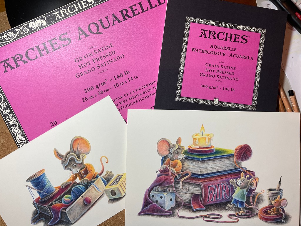
Maybe three years ago I bought my most expensive paper: Arches Watercolor Grain Satiné.
First I found it somewhat strange. It has this interesting texture. Like really small plain binding. It has a tendency to build this little dark spots, when drawing with dark pencils. It felt like roughing up the fine fibers on the surface. Okay it is a cotton watercolor paper, so I thought maybe it is not really suited for drawing with colored pencils.
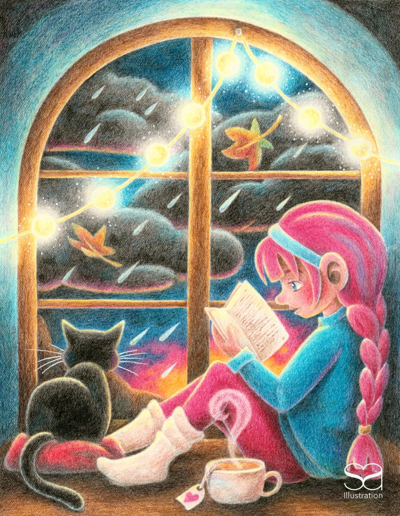
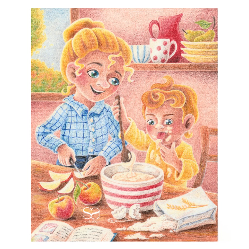
Here are my first two drawings on this paper I did back in September 2024. My drawing skills developed a lot since then. I used Faber Castell Polychromos on the girl in the window and Derwent Lightfast on the other one. This one is lacking depth.
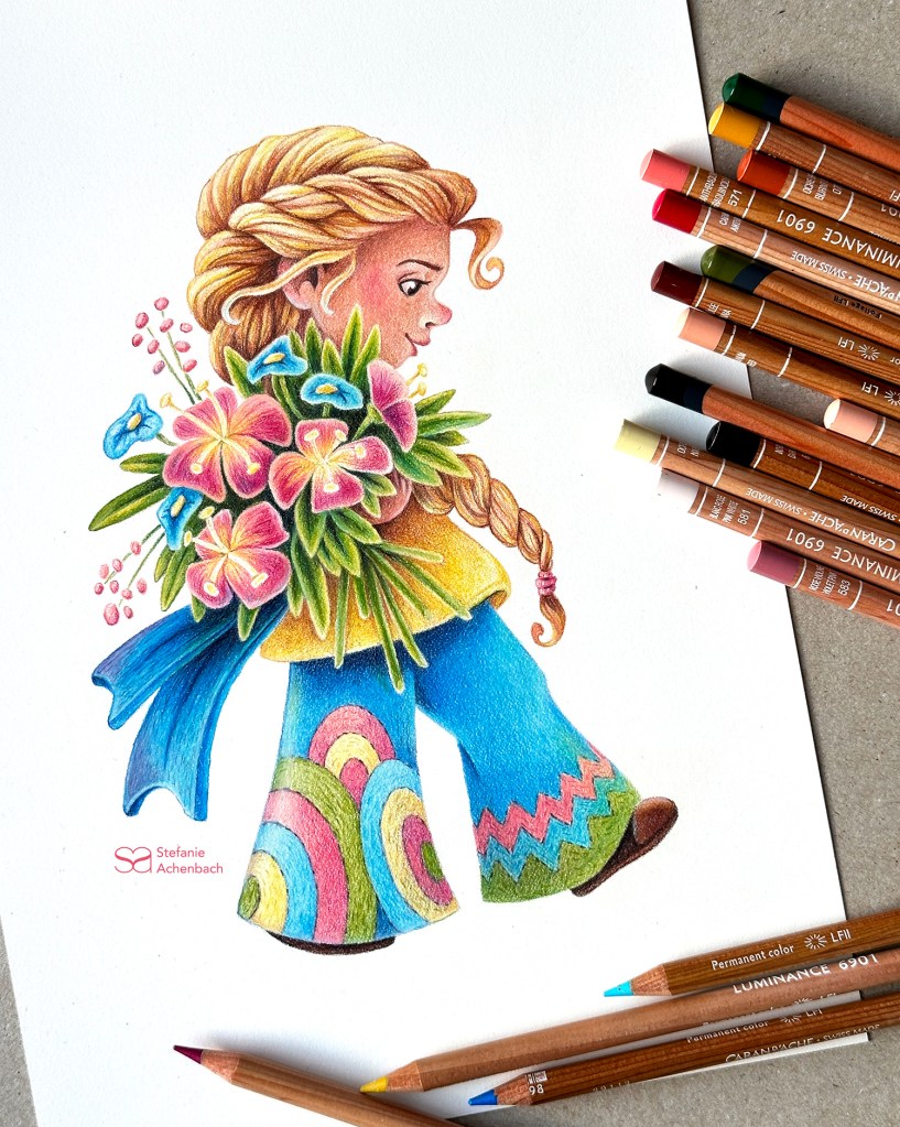
I switched to an inexpensive watercolor paper with lot of texture which I enjoyed a lot. But it was really hard to get a nice colorful finish. I remembered the Arches paper just recently and drew my flower girl on it. I used Caran d’ache Luminance and it was a delight. I enjoyed to work on the soft color transitions. The colors are so vibrant. I just found out that this paper can handle a lot of pressure to deepen the colors.
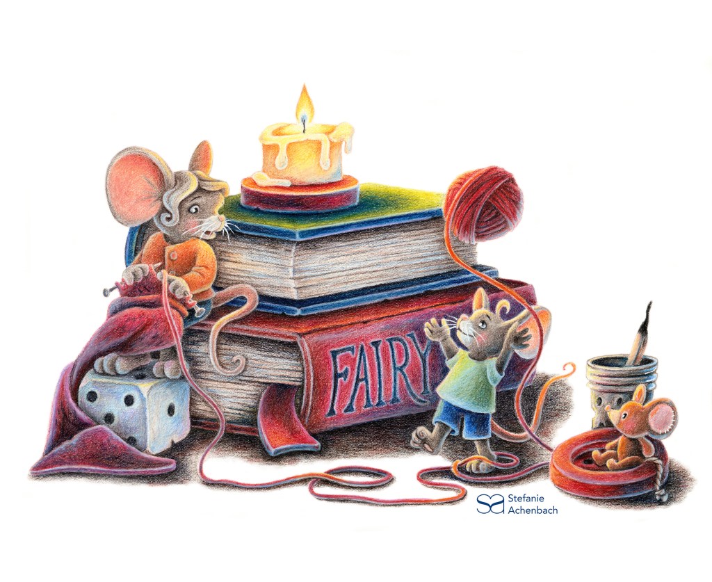
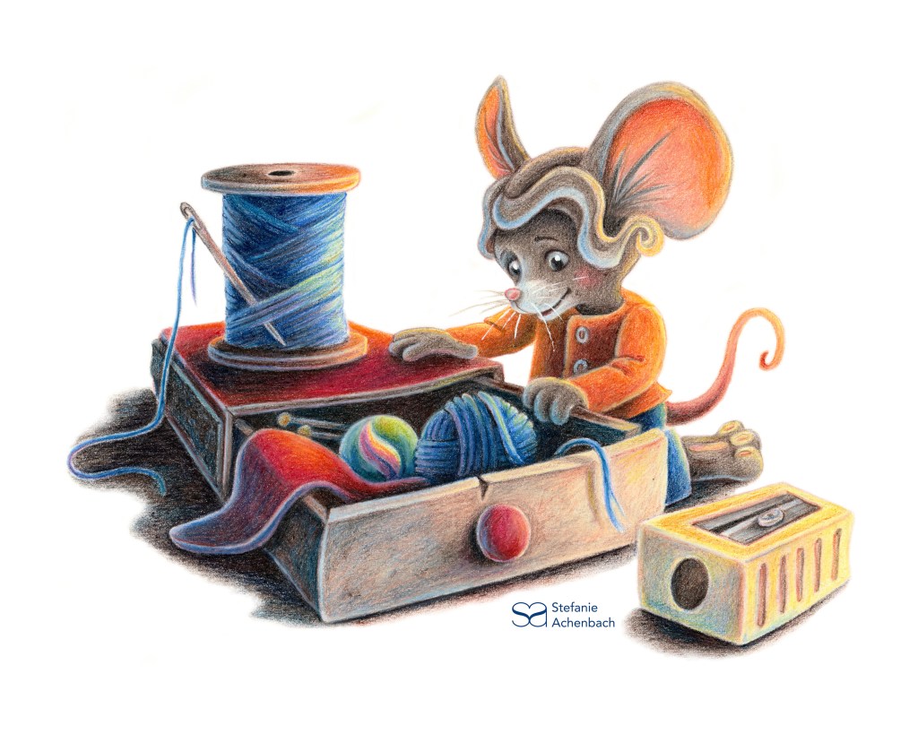
So I used it for a little story project. Since I wanted the freedom to draw larger pictures on this superb paper I bought another block. This was a little bit larger. For my actual project I cut one piece in two halfs. And I was surprised. This new paper is much smoother, with much less texture. The colors a less vibrant. Of course I can make them more colorful in Photoshop but the drawing experience is not the same. And the result looks a little bit different too. Arches? Why did you change this wonderful paper?! What was wrong with it?

Hinterlasse einen Kommentar